I’ve always kinda wondered whether the cover art for The Knife’s eponymous debut album was intended to be a reference to something.
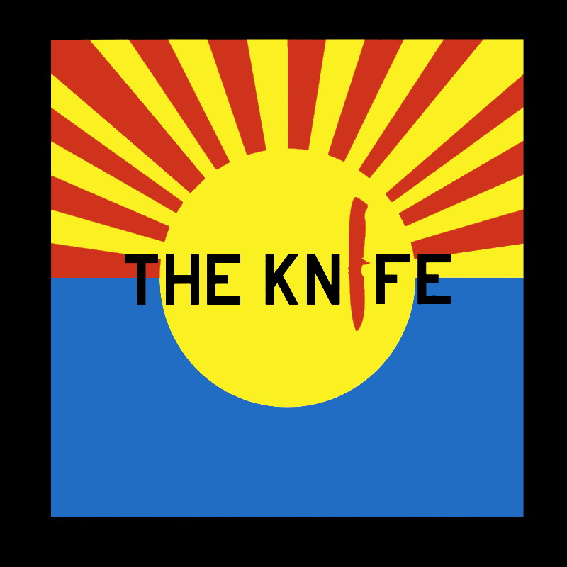
It may simply have been a mistake, but there seems to be some weirdness in the rays here. They’re not of uniform thickness and their spacing interval is inconsistent, resulting in subtle asymmetry.
I suspected for a while that the cover was meant to be a take on the Rising Sun Flag.

Then I happened to stumble upon the state flag of Arizona. This seems to be a closer match, at least color-wise.
